18 Tried-and-True Tactics Employed by Comic Cover Artists to Grab the Attention of the Comic-Craving Collective
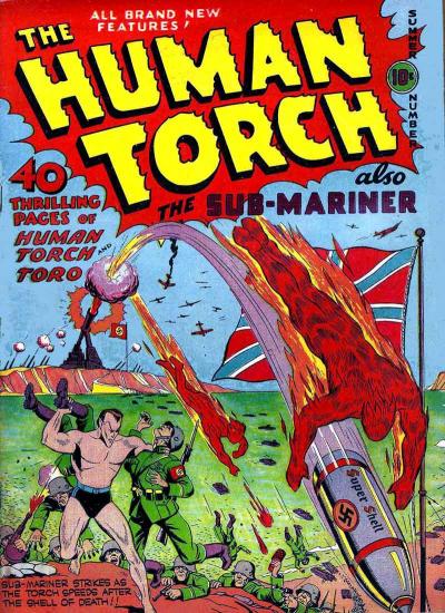
1. “Annnnnd…. action!”
Long before comic publishers resorted to cover gimmicks and the art of Alex Ross to grab the attention of an increasingly attention-deficited readership, the right cover art often meant the difference between life or death for a title. That was especially true during the Golden Age years, when hundreds of titles competed furiously for the dimes of youngsters and GIs alike. The sales numbers told publishers that good old-fashioned action shots was what their audience wanted, so action shots is what they got, and plenty of it: rarely did a month go by without a title’s hero swooping into action or delivering a good right hook to some nogoodnik (suck fist, Hitler!). Later on , the prodigious Nazi-bashing would take a backseat to straight depictions of a key scene in the comic story, but the basic brand promise (“BIFF! BAM! POW!”) stayed intact.

2. “Strike a pose. There’s nothing to it, really.”
When the heroes of yore weren’t busy pushing war bonds or giving Ratzis a piece of their mind, they often took time out of their schedules to pose for the perfect pin-up shot, like this very early Superman cover. These types of covers — devoid of action, heavy on the brand-building – were and are handy for publishers in that the images aren’t tied to any specific storyline (and could be moved around on the production schedule as needed), plus they gave the heroes a chance to look imposing before getting back to head-busting business. The iconic cover pose never went away — heck, for most of the ’90s it was the industry standard — but most publishers have since glommed on to the fact they’re best experienced in small doses, since readers typically already know who the star of the show is.

3. “Extreme close-up!”
Related to the pin-up shot is the extreme close-up, with a main character’s face taking up all or most of the cover, literally getting in your face. In 1997, DC rolled out its “Faces of DC” gallery, with most covers for the month of December featuring nothing but an extremely tight head shot of the book’s title character (or a prominent team member, in the case of team titles). The books’ logos were even removed and replaced with titles rendered in a smaller, uniform typeface to allow for maximum cover art space. Imagine a wall of almost life-sized faces staring out at you from the comics rack, and you begin to understand the effectiveness of this kind of approach.

4. “Say cheese, everybody!”
This type of image is more commonly found on the covers of first issues or issues that introduce a new group of people. No action, no perilous predicaments, just an assembly of the characters inside, many or all of whom the reader may be about to meet for the first time (or for the first time together as a team). The effectiveness of this approach can be easily seen when you look at the cover of Kevin Maguire’s Justice League #1 (5/87), one of the few modern-day covers that has inspired many imitations and homages over the years. For instance, when DC launched Justice League Europe a few years later, the team members were shown in the exact same pose as this one, with one of the characters holding a copy of Justice League #1 and saying, “Wow. Déjà vu.”

5. “What the fudge…?”
Sometimes, the cover poses an intriguing situation that would normally be impossible in the character’s “official” continuity, and the bet is that readers will pick up the issue to find out what the heck is going on and how the hero got him/herself into yet another crazy predicament. Superman’s editors in the ’50s and ’60s were notorious for creating the cover situation first (It’s Baby Superman! Old Man Superman! Caveman Superman! Giant-Headed Superman!) and then ordering the writers to work backwards to come up with a plausible explanation for how Superman got into that situation (and, amazingly enough, it wasn’t always attributed to a dream, hoax, or yet another color of kryptonite).

6. “Geez, he’s not about to kill that guy, is he?”
One thing you can depend on when it comes to our heroes: they will never, ever cross that line that separates them from the murderous criminals they bring to justice… or will they? “Dirty Harry” covers — like this one showing a seriously cheesed-off Daredevil during Frank Miller’s legendary run, or Todd McFarlane’s “Batman: Year Two” cover showing a Batman with a gun and holster, or Mike Zeck’s image of Captain America with an Uzi a-blazin’ — tantalize readers by placing a hero in a situation where it appears as if he’s about to do something that goes against his moral code… and really, deep down don’t we all want to see that happen, just a little bit?

7. “Cower, mortals, at the unknown!”
Sometimes, a cover is striking for what it doesn’t show the reader. Instead of placing the issue’s villain front and centre, we see characters react to something or someone off-camera, usually uttering some variation of “No! It can’t be! Not… you!” Marvel Two-in-One, Marvel’s old team-up title starring the Thing, practically redefined “formulaic” for most of its run, but a highlight of the series was this issue’s cover. It was a playful jab at the Distinguished Competition that suggested the guest star was none other than a certain Dark Knight Detective, but — spoiler! — it wasn’t him. Still, the idea that it could be him is made implicit by the shadowy menace that appears to hold a flabbergasted Thing’s attention, and that’s enough to attract some readers’ attention.

8. “Look! Floating heads!”
Why aren’t there more floating heads on covers these days? Everything just seemed simpler back in the days when you could count on a bunch of floating heads to tell you how you should react to a cover. This 1982 issue of Justice League of America, for instance, shows team members from not one, but three super-teams reacting in horror to the Dude with a D’s assertion that “the world is MINE!” (Said dude is Per Degaton, whose name is German for “by Degaton.” You’re welcome.) Clearly, someone this capable of reducing three entire super-teams to a state of bug-eyed agogness is someone with great and evil plans up his fascist sleeve… but it’s gonna cost you 60 American cents to find out what those plans are, so pony up.

9. “Yeah, I’m talking directly to you, Mister I’ve-Got-Disposable-Income.”
Every so often, you’ll find a cover that speaks directly to readers by literally speaking directly to readers, either by way of a plea or a direct promise to deliver action and excitement (not to mention the numerous variations on the “buy this book or the dog gets it” gag). A personal favorite: The Flash #163 (8/66), a books whose cover features the Scarlet Speedster yelling, “STOP! Don’t pass up this issue! My LIFE depends on it!” When this book first appeared on store shelves and spinner racks across America (and parts of Canada), do you think any young child saw those words and thought immediately that an actual person’s life was in peril, and that he was imploring them for help? Probably not — even a generation raised on The Beverly Hillbillies wasn’t that dumb. But it’s nice to imagine someone did.

10. “Bold artistic statement or five minutes to deadline? You decide!”
Borrowing from the “less-is-more” school of art, this type of cover makes copious use of white space to differentiate itself from the kaleidoscope of color on the other books around it. These types of covers are especially effective when the goal is to show the issue’s title character despairing against overwhelming odds, especially if the hero is shown whimpering in the corner. Snowbird, the team member featured on the cover of Alpha Flight #6 (1/84), does not seem to fall in that category, but it’s clear she’s battling some kind of overwhelming odds, or perhaps fighting a foe inside a blizzard. (In fact, that’s exactly what she was doing; as part of Marvel’s Assistant Editors Month stunt, this issue featured six pages with no art whatsoever, just blank panels with word balloons and sound effects to indicate a fight scene taking place inside a magically generated snowstorm. Good times.)

11. “So many pretty colors…”
Going the opposite route, this technique involves throwing a multitude of colors and shapes at the canvas in an over-the-top attempt to arrest the reader’s attention. In the case of Booster Gold #19 (8/87), the choice to go wild with the paint palette was particularly apt; the guest villain for this issue is the Rainbow Raider, one of the Flash’s goofier foes (and, in a crowd containing the likes of Captain Boomerang or the Top, that’s saying a lot) who uses special goggles that shoot beams of colors for various effects, including rendering our avaricious avenger blind by the end of this issue. And the villain’s motives for committing such dastardly deeds? Why, he was born completely color-blind and therefore unable to fully utilize his natural-born painting talent, and so felt compelled to take out his frustrations on society at large. Seriously.
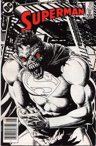
12. “Just like how them old-timey movies used to look!”
More fun with colors, only this time we’re working in a dichromatic black/white environment to discover what old-school cinematographers knew all too well: nothing builds suspense or creates a memorable tableau like the right combination of light and shadow. Sometimes, in addition to the black-and-white rendering, a judicious use of spot color is employed to is used to divert attention to a specific part of the cover; take this Brian Bolland cover from Superman #422 (8/86), an image in which your eyes are immediately drawn to the inhumanly red orbs of our bizarrely transmogrified Man of Steel.
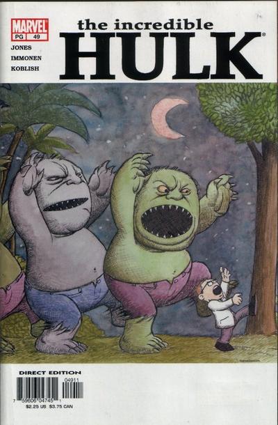
13. “It’s pronounced ‘homage,’ people. Silent ‘h’, all right?”
In recent years, quite a few cover artists seem taken with the idea of paying homage to a movie poster, album cover, or famous comic from the past. A mid-‘90s She-Hulk cover looking a lot like the poster for Pulp Fiction comes to mind, and a pretty decent list could be made of all the comic covers paying homage to the cover of Action Comics #1. Kaare Andrews went the homage route with a nod to a classic Jim Steranko image on the cover of Incredible Hulk #34 (1/02), but from a pure enjoyment standpoint it’s hard to beat his Where the Wild Things Are pastiche on the cover of Incredible Hulk #49 (3/03), easily one of the Top 10 covers of the 2000s.
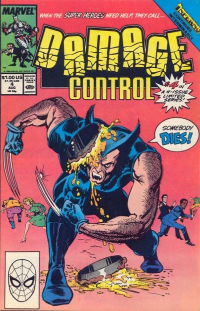
14. “And now for something completely different.”
Boy, those superheroes sure are a surly bunch, aren’t they? Always gnashing their teeth and grimacing as they go about their business… would it kill them to break a smile once in a while? Sure, it can’t be comfortable running around rooftops in Spandex leotards and allowing similarly dressed mental cases to take shots at them, but where are the heroes who can see the lighter side of superheroing? Oh, there they are, on the cover of just about every issue of the 1980s Justice League series. Or over there, on an early issue of Excalibur showing a prostrate Captain Britain with a large footprint-shaped bruise on his chest and Juggernaut ambling off into the sunset (“…and there’s more where that came from,” our hero weakly warbles). A personal fave: a pied Wolverine on Ernie Colon’s cover for Damage Control (Vol. 1) #4 (8/89) – an image that series writer Dwayne McDuffie once told me almost got him fired, as apparently someone higher up in Marvel did not see the humor in throwing a pie at one of the company’s more lucrative assets. (Killjoys.)

15. “This is how these characters would look in real life. Enjoy!”
Photo covers were all the rage during the heyday of romance comics, and you could always count on stills of famous celebrities appearing on the covers of comics based on popular television shows or movies. Superhero comics tended to shy away from photo covers, given the fact that superheroes are, y’know, fictional and all, but that hasn’t stopped a few brave souls from attempting to put 3-D flesh on our favourite heroes. The cover of Marvel Team-Up #128 (3/83) showing a real-life Spider-Man and Captain America was particularly noteworthy for showing the world just how goofy a guy dressed as Captain America can look, but check out Amazing Spider-Man #262 (3/85), featuring a photo cover of a real-life Peter Parker caught in mid-costume change by a tabloid photographer’s camera. I think it’s the belt buckle that really sets it off; I never really pictured Parker as a big belt buckle kind of guy.
16. “Naw, we’re not messing with your mind, just our logo.”
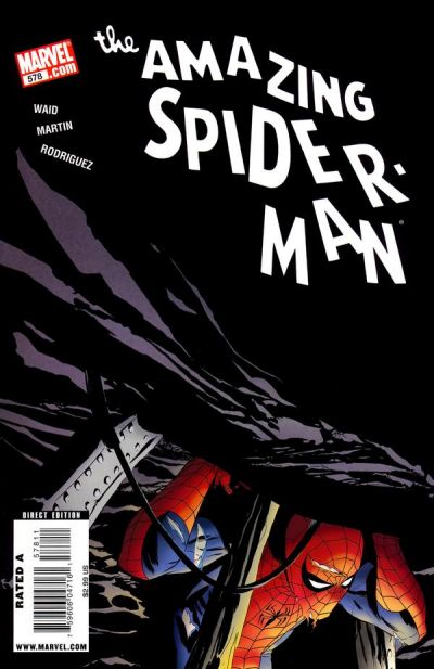
Oftentimes, it’s not the pictures on a cover that can attract a reader’s interest, but the words that surround the art. Speech balloons on comic covers seem to have fallen out of favor in recent years, but incorporating the book’s title into the action certainly hasn’t. Whether it’s Blockbuster punching Batman’s name into itty-bitty pieces, or Beta Ray Bill using his hammer to smash Thor’s name to smithereens, or the Living Monolith grabbing at the giant X-Men logo above him, the end result is the same: a deviation from the norm, which is what every eyeball instinctively seeks out. Kudos to Marcos Martin, by the way, for the cover image on Amazing Spider-Man #578 (1/09) — a piece of art that manages to both draw Spider-Man’s logo into the scene and serve as a decent homage to a classic Ditko sequence.
17. “Words blowed up real big.”
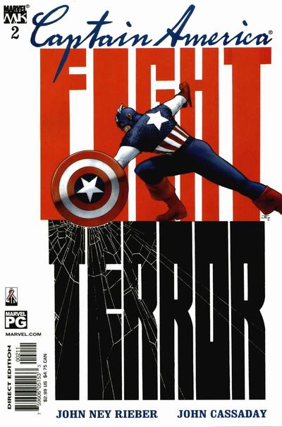
Have you ever noticed how the right word, especially when it’s a really big word in a really small space, can really grab someone’s attention? Words are funny like that. And while most comic covers tend to place an emphasis on images to sell the book, you can be sure that a few judiciously placed words, ESPECIALLY IF YOU BLOW THEM UP REALLY BIG, can be just as effective in attracting reader attention. Want proof? Take a gander at this John Cassaday cover for Captain America #2 (7/02) and then try to guess what then-recent world event may have inspired the storyline inside.

18. “We’re artists. Deal.”
Ever found yourself staring at a comic cover and wondering with fascination just what, exactly, a bottle of seashells, a string of beads, disembodied doll heads, and a person with a crow’s head wearing a kimono and holding an animal skull has to do with the story inside? No? Then let me know when you’ve made the acquaintance of Dave McKean and his ilk. ‘Cause that stuff will blow your mind, man…
